Content Marketing Reporting: The Complete 2026 Guide
Only 46% of B2B marketers measure content performance well. Here's the metrics, tools, and dashboards that separate guesswork from real results.
Reporting on content performance has never been straightforward, and it's now harder than ever.
Google organic traffic is eroding as AI “consumes” clicks. Basic analytics obscure AI referral traffic. Multiple third-party tools are needed to track overall search visibility (e.g., rank tracker, AI search visibility tracker, etc.). And B2B content often influences deals that take months to close, making clean attribution nearly impossible.
It's not surprising that only 46% of B2B marketers measure content performance effectively.
Proper content marketing reporting is the solution. When done well, reporting turns raw data into a structured view of what your content is doing for the business. By the end of this guide, you'll know which metrics actually matter (and which don’t), how to structure reports (and which tools to use), and how to build a report your team can count on.
A quick note before we get into it: most of this guide is general advice that applies regardless of your stack. But for the tools and dashboard sections, I'm going to get specific and show you exactly what I use, including the actual reports I check every week. Take what's useful and swap in your own tools where it makes sense.
What Is Content Marketing Reporting? (And Why Most Teams Do It Wrong)
Content marketing reporting is not about pageviews. It's about understanding how your content actually impacts your business: Is it attracting your target audience? Is it moving visitors towards a decision? Is it driving conversions and contributing to revenue?
Most teams get this wrong in one of two ways …
- Data overload: messy analytics that are full of charts with no clear story connecting them.
- Vanity metrics: social impressions, raw traffic, and post counts that “look good” but tell you nothing about whether your content is actually working.
In other words, teams build reports around what's easy to pull, not around what actually answers the business questions they care about.
"Don't fall into the trap of making things matter because they're measurable. Make them measurable because they matter." - Robert Rose, Chief Strategy Advisor at the Content Marketing Institute
Asher Rumack, VP of Creative Strategy at Column Five Media, makes the same point from an agency seat. "Traffic is definitely overrated," he says. Column Five doesn't sell ads, so a single blended traffic number tells him little about whether the site is doing its actual job: drawing in agency clients. Instead, he treats leads as "a lagging indicator of how you brought people to your site who are interested in your business," while the leading indicators he actually watches day to day are "the ranks and the AI visibility and citations."
To fix this, you need to pay closer attention to impact metrics, not activity metrics.
- Activity metrics measure what your team is doing: posts published, social impressions, email sends. These are useful for tracking output, but they don't tell you whether that output is creating value.
- Impact metrics measure how your content is impacting the business: leads generated, inbound conversions, pipeline influenced, and revenue attributed. These are the numbers that justify content investment.
The Core Content Marketing Metrics Worth Tracking
"If the metric is easy to see, you're probably putting too much importance on it." - Andy Crestodina, Co-Founder and CMO of Orbit Media Studios
There’s no shortage of data available to content teams. The trick is knowing which metrics are worth monitoring and which are just a distraction.
1. Earned traffic
Questions answered: Are we reaching new people, where are they coming from, and is that mix shifting?
Earned traffic includes:
- Organic search traffic
- Direct traffic
- Referral traffic
- AI-driven referrals (traffic from ChatGPT, Perplexity, etc.)
It should not include paid traffic. You want to see traffic that your content is driving on its own merits, not what you can send to it by spending money on ads.
2. On-page engagement
Questions answered: When people arrive, do they actually read? Are we giving them what they came for?
On-page engagement includes:
- Time on page
- Scroll depth
- Bounce rate
- Dwell time
Dwell time is particularly important here. It’s the amount of time a visitor spends on your page before returning to search results. A short dwell time suggests your content either didn't match what the reader came for or didn't keep their attention. Both signals are worth acting on.
3. Search performance (SEO & GEO)
Questions answered: Are we earning lasting search visibility, and is it converting into visits and inbound conversions?
SEO/GEO performance includes:
- Keyword rankings
- Prompt visibility
- AI search Share of Voice
- Organic click-through rate (CTR)
- AI citations
- Backlink growth
✅ Key insight: Over 96% of all web pages receive zero organic traffic from Google. That's not a reason to panic, but it is a reason to measure. Reporting on SEO and GEO performance tells you whether your content is actually ranking, earning search visibility (across both Google and AI search), and driving qualified traffic.
4. Lead generation
Question answered: Is our content attracting people who actually want what we offer?
Lead generation includes:
- Form submissions (signups, demo requests, content downloads, etc.)
- Inbound conversions broken down by landing page (e.g., Page, blog post, etc.)
Leads or conversions by landing page is more actionable than total lead volume because it shows you which pages or blog posts are performing best. A post that sends 200 visitors a month and converts five into leads is outperforming a post that sends 2,000 visitors with zero conversions.
5. Conversion & ROI
Question answered: Is content investment paying off, and how does it compare to other channels?
Conversion & ROI includes:
- Content-driven journeys
- Cost per lead by channel
- Content-sourced pipeline
This is the hardest category to measure well and the most important for leadership. No one has perfect attribution. But even a rough picture of how content contributes to pipeline is more useful than no picture at all.
When you can show that content-sourced leads close faster, cost less, or convert at a higher rate than other channels, you can stop defending your content budget and start growing it.
Content Marketing Reporting Tools
You don't need an expensive tech stack to report well. As mentioned earlier, this is the section where I'll get specific. Here's a practical breakdown by function, including the actual tools I use and why.
For web and SEO data
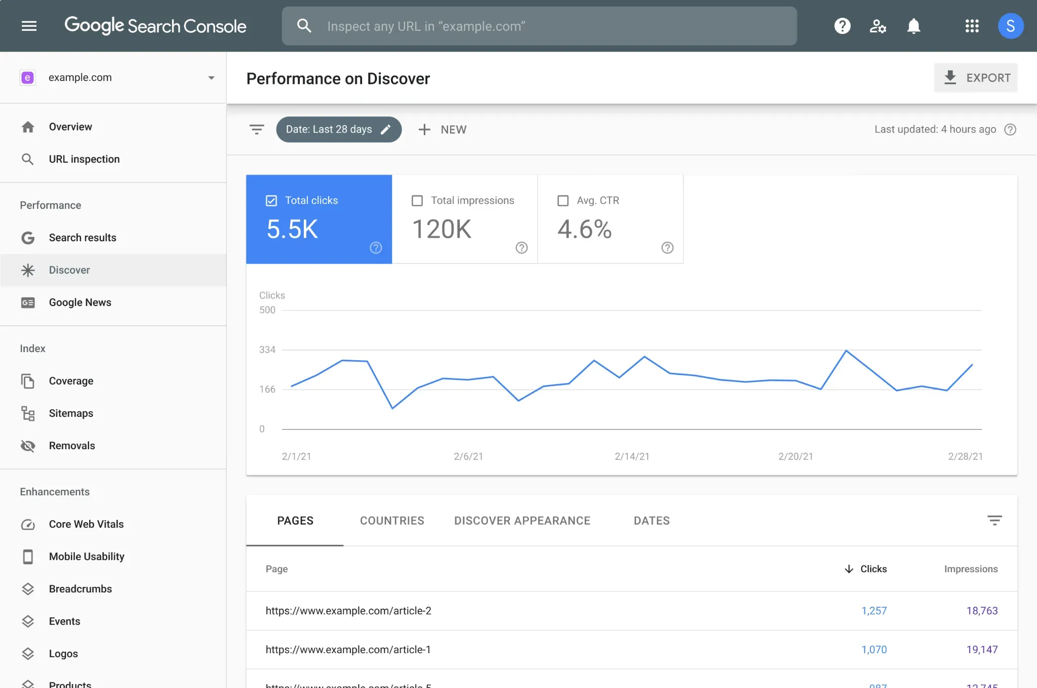
Google Analytics 4 and Google Search Console are the foundation, and they're free. GA4 gives you on-site behavior data; GSC gives you organic search performance, keyword impressions, and click-through rates.
For most small teams, a well-configured GA4 and GSC setup covers a substantial portion of reporting needs.
The caveat with GA4 is that it is notoriously difficult to use. Alternatively, you might look at Ahrefs Web Analytics or PostHog. Ahrefs Web Analytics is free for up to one million events per month.
PostHog is a broader analytics platform with web analytics, session replay, funnel analysis, and conversion tracking. It works well for technical teams who want more control over their data.
I have both PostHog and GA4 installed on my websites. GA4 is the default and works as a good fallback. It’s also more useful when combining it with a dashboard tool like Databox, which makes working with the data easier. PostHog is easier to navigate when you just want to find which pages are driving the most traffic, from which sources, and so on.
For keyword and backlink tracking

Semrush and Ahrefs are the two most dominant options. Both show keyword position changes, competitor gaps, and backlink profiles. Ahrefs also offers Brand Radar for monitoring how your content appears across AI platforms including ChatGPT, Gemini, and Perplexity.
Personally, I use Ahrefs. I find the UI cleaner and easier to use than Semrush. For keyword tracking, I always have one target keyword for each piece of content I create. I add that keyword to Rank Tracker after publishing so I can monitor the keyword ranking over time. If it improves and ranks on the first page, great! But if not, I’ll be able to quickly tell and make improvements to the post to help boost its position.
For AI search visibility

Profound and Peec AI are two of the most well-known options here. But this category has exploded in the past few years, and there are a ton of options (I could easily list more than 50): Brandlight, Scrunch, Goodie, Athena, LLMrefs, Trakkr, the list goes on and on. Ahrefs and Semrush both have tools for monitoring AI search visibility as well.
All of these tools help track your brand’s visibility across AI answers, including ChatGPT, Perplexity, Gemini, and Google AI Overviews.
For lead attribution
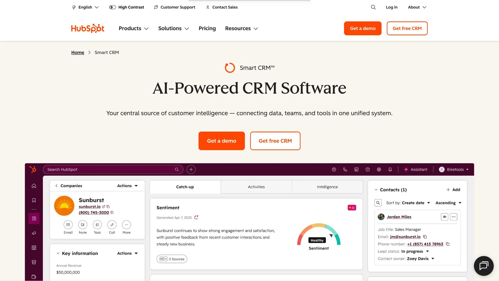
Your CRM is likely the best source here, whether that's HubSpot, Salesforce, or something else. The goal is tracing leads and revenue back to the content that first brought visitors to you or nudged them toward a conversion.
Viktor Hendelmann, co-founder of GenViral, uses DataFast for this specifically because it ties directly into revenue. "It has embedded revenue tracking," he says, after connecting it to the company's payment provider. That setup lets him "literally track from the landing page to the conversion, what does convert and what doesn't convert in terms of pages," which is harder to get out of GA4 or GSC alone.
For dashboards
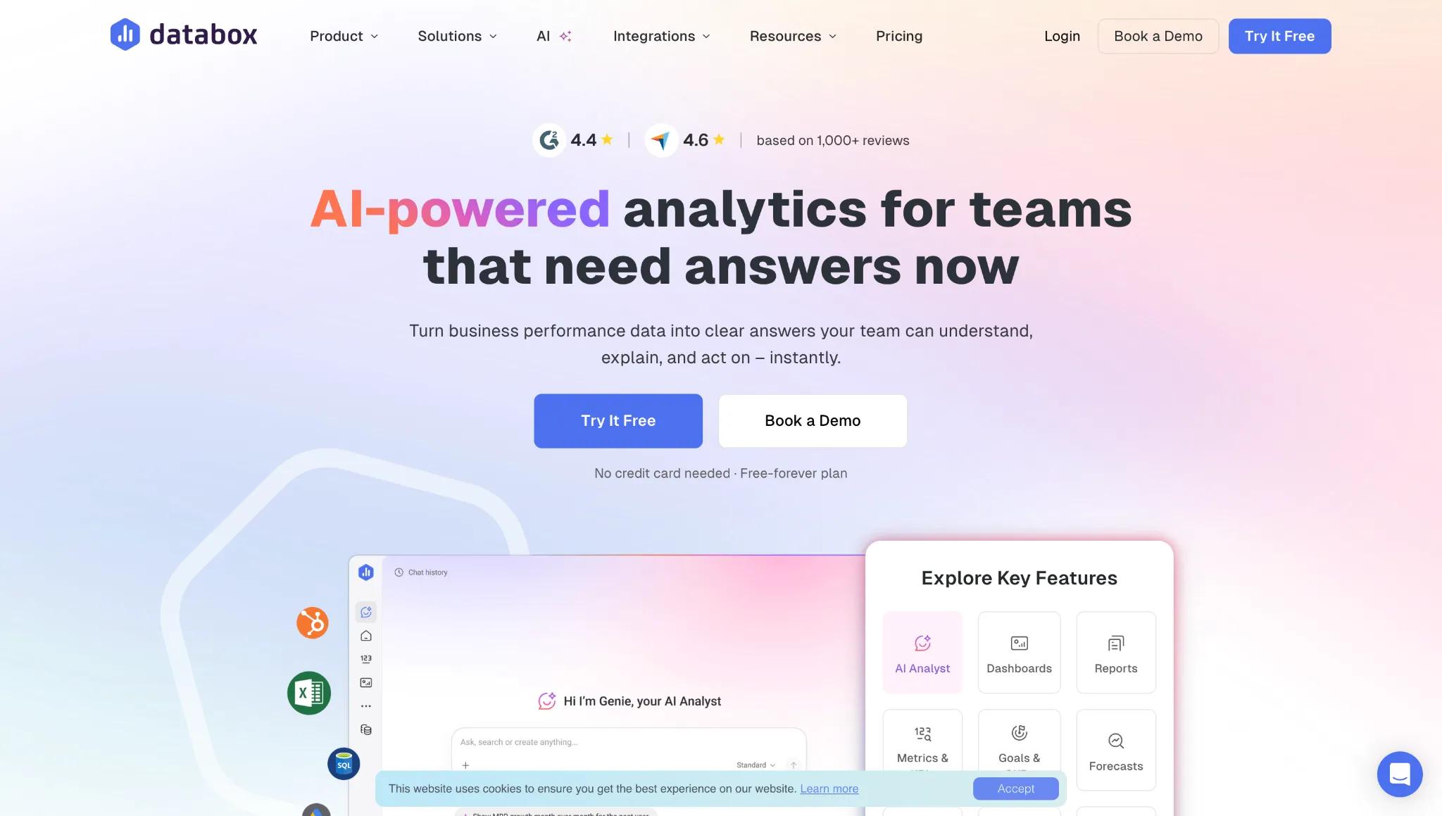
Looker Studio is the place where most teams start. It’s free and integrates natively with GA4 and GSC. You can create custom charts, reports, and pull in data from external sources like HubSpot and Salesforce.
The tradeoff is that Looker Studio isn’t always the easiest to work with (there’s a learning curve, and reports that seem easy to put together actually take a lot of work), and it’s also not the most visually appealing.
Databox, Geckoboard, and AgencyAnalytics offer more visual customization if you're willing to pay for it. My favorite is Databox (it’s the simplest to use IMO and the best looking), but it’s pricey (the lowest paid plan starts at $159/month, though there is a limited free plan).
How To Create A Content Marketing Report
Below is an example of the kind of dashboard I mentioned earlier, built in HubSpot to show traffic growth tied to conversions. You can build a similar dashboard in Looker, Databox, or even something custom using Claude or Replit.
Asher Rumack does exactly this at Column Five Media. "Claude is also the command center for the reporting too," he says, describing how it plugs into the agency's internal brand tooling to generate client-ready reports in their own look and feel. "It looks like I'd spent a whole week making this report, but lots of times it's just a couple hours in Claude."
The point is to have one centralized dashboard that shows how traffic growth correlates with inbound conversions (signups, demo requests, etc.). You should be able to quickly and easily answer:
“Is traffic going up and to the right, and is that traffic leading to qualified inbound conversions?”
Let’s go through each of the sections in the report and why they’re important so that you can use this example as a guide to build your own content marketing dashboard.
(All of these screenshots are from one dashboard. I just split them into smaller images so it’s easier to read/view.)
Traffic overview
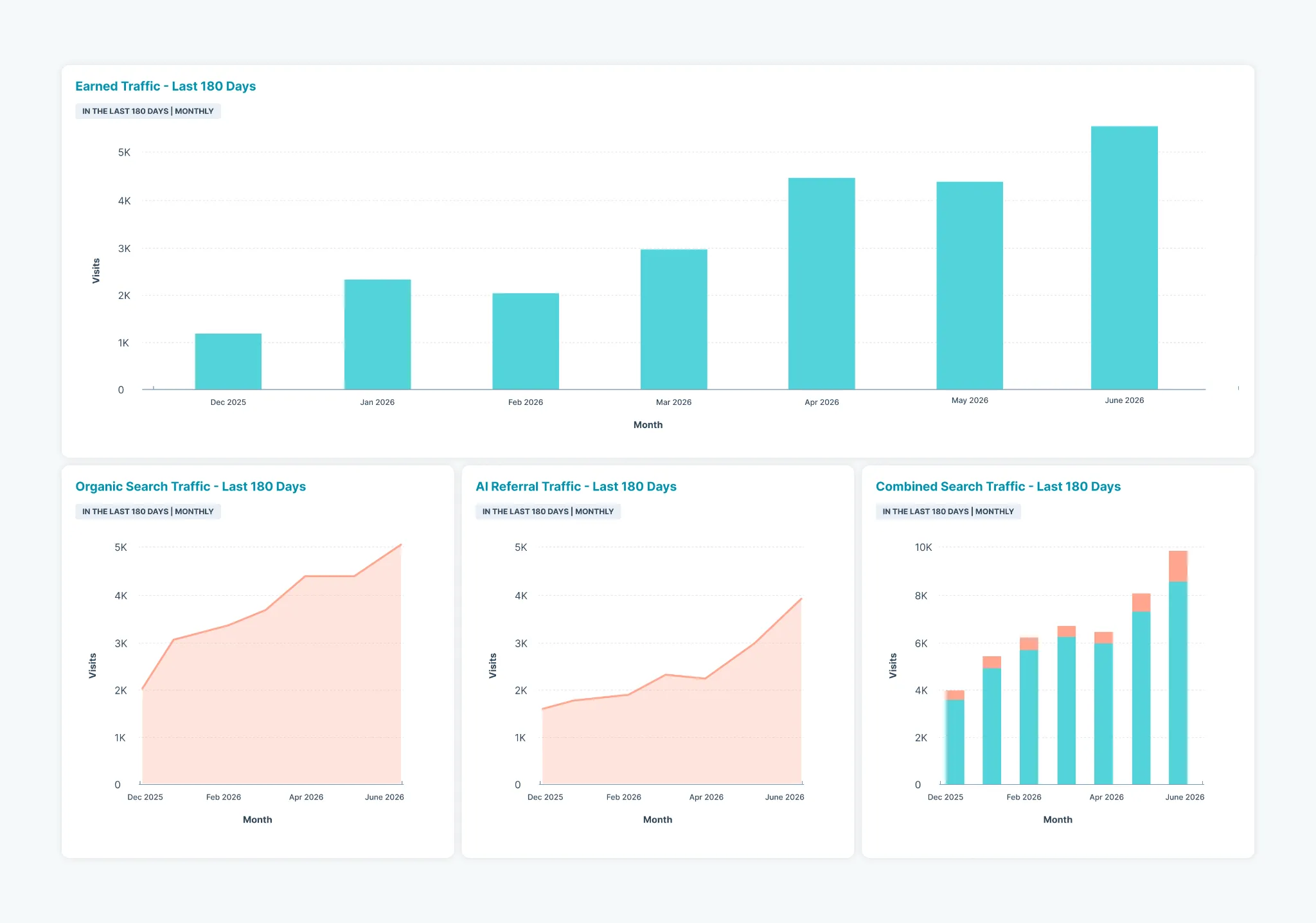
This section shows traffic growth at a glance. It includes:
- Earned traffic (Traffic you own, everything except paid traffic)
- Organic search traffic (Traffic from Google)
- AI referral traffic (Traffic from ChatGPT, Perplexity, etc.)
- Combined search traffic (Organic + AI referral traffic)
This reporting easily helps us see if traffic is growing month-over-month or quarter-over-quarter. You will likely have a down month or two throughout the year, even if your traffic is growing, due to seasonality or holidays. But seeing traffic data like this shows if the general trend is going up and to the right.
Seeing combined search traffic is important because it shows whether your traffic is growing as a whole across Google and AI platforms (ChatGPT, Perplexity, Gemini, Claude, etc.). Different platforms may grow or decline in use, but this report shows if your traffic is growing, no matter who the dominant search engine is.
Inbound conversions (demo requests)
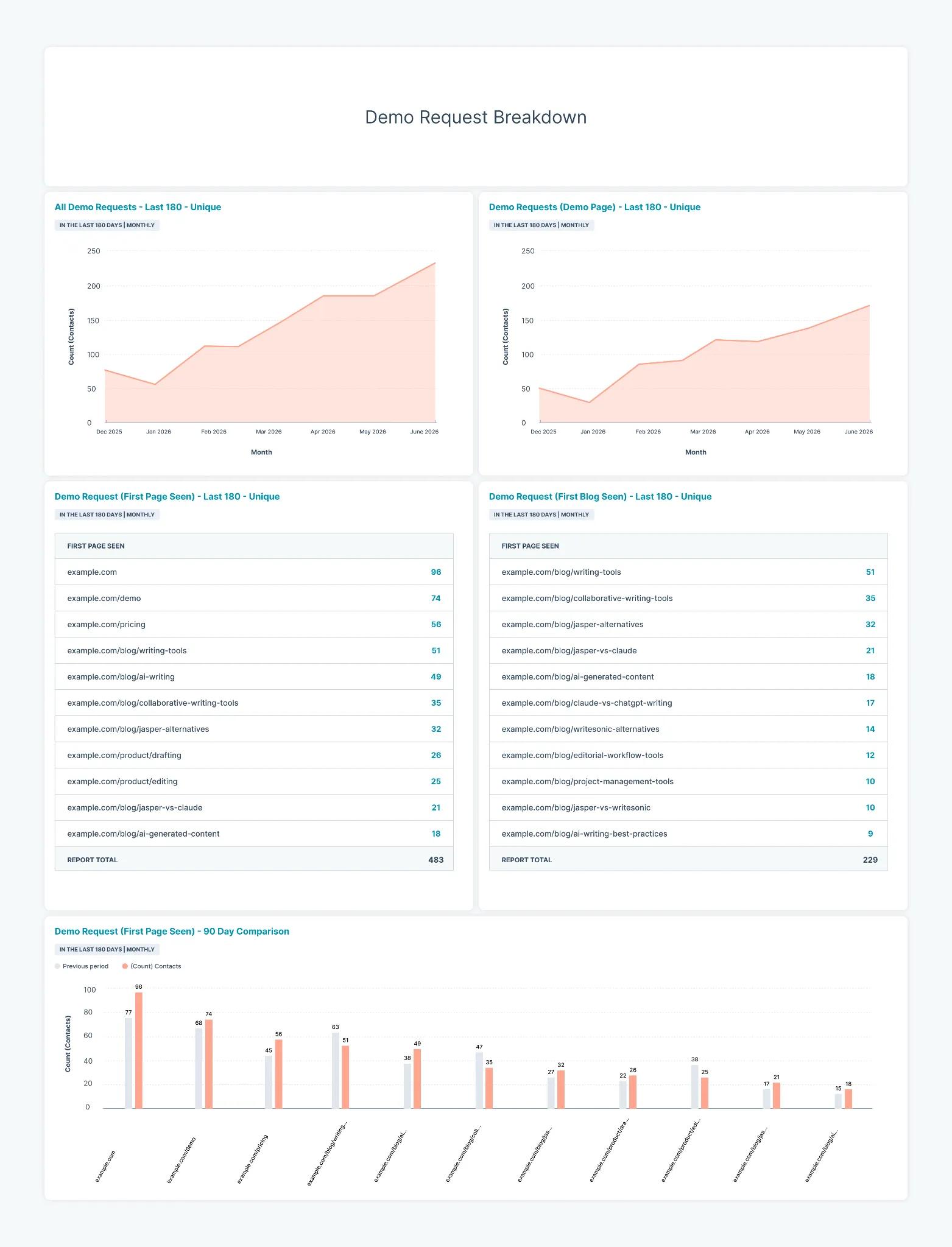
Below the traffic overview, I like to put inbound conversion growth reporting (in this case, we’re looking at demo requests). This is the most important section within this dashboard as it shows how the content we create connects to actual results. Traffic growth is great, but what we really care about is conversions.
The first two charts show total demos and demos made specifically on a demo request page. If you have a pricing page with a request form, you could also add that. This shows which pages drive the most demos.
The section below that gets more granular and shows demo requests by which page the visitor first landed on, broken down by all website pages and blog posts. This helps us understand which pages and blog posts are leading to the most demo requests, and answers “Is the content we’re creating actually leading to conversions?”
The last chart shows demo requests by page over the last 90 days compared to the previous 90 days. This helps us understand which pages are leading to more demos over time, and which ones are starting to slip. If a post is starting to slip in conversions, it could be due to declining Google rankings or visibility in AI search.
Both signal that the post could use a content update to improve the quality and freshness of the content, which could lead to improvement in rankings and visibility.
AI referral traffic
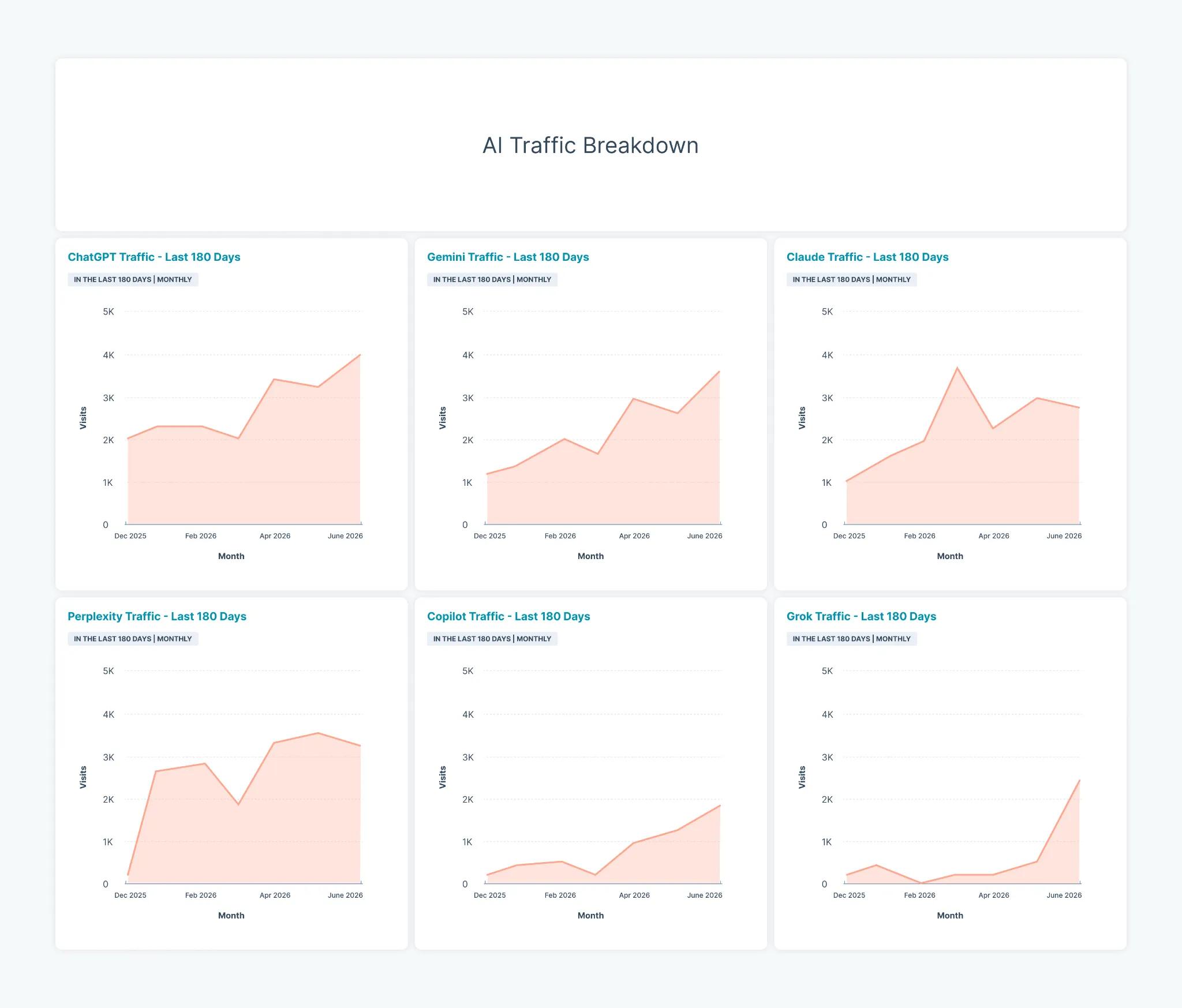
The AI referral traffic section comes next. This shows a more granular view of our
AI referral traffic split by the top AI Engines: ChatGPT, Gemini, Claude, Perplexity, Copilot, and Grok.
We can see which AI platforms are driving the most traffic, and whether or not that traffic is growing over time.
Blog subscriber growth
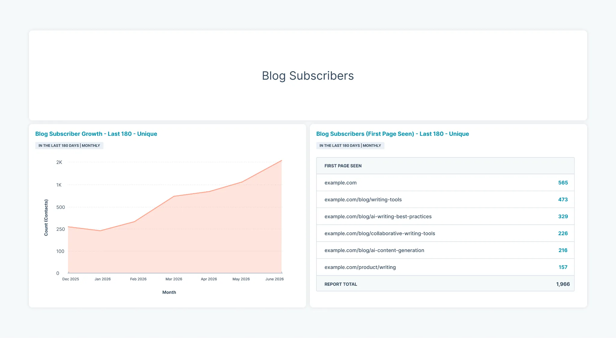
The final section in this dashboard shows blog subscriber growth.
Not all visitors will be ready to request a demo when first landing on your website. Growing blog subscribers should be a secondary CTA for your content so you can get visitors into your database and nurture them over time.
This section shows how many blog subscribers you are getting each month, and which pages/blog posts are leading to the most subscribers.
Keyword rankings
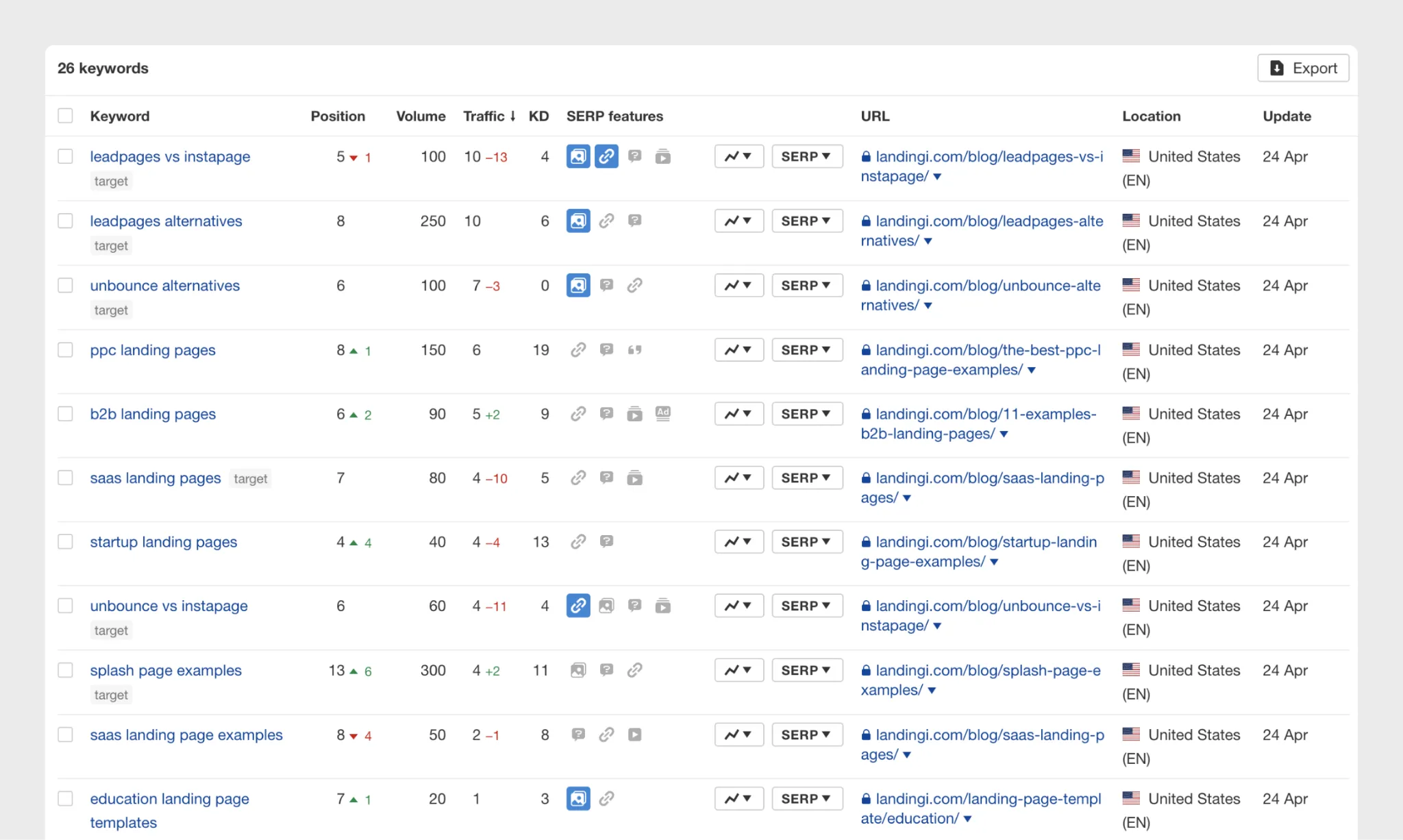
This is a separate report in Ahrefs that shows keyword rank positions in Google. There is no way to pull this data directly into a HubSpot report. But if you’re using something like Databox, you can pull this information into one dashboard if you’d like.
Either way, you want this data so you can keep a close eye on your keyword rankings and whether or not the content you create is climbing in rank over time. This report gives you a granular view of how your content is performing in Google.
AI search visibility
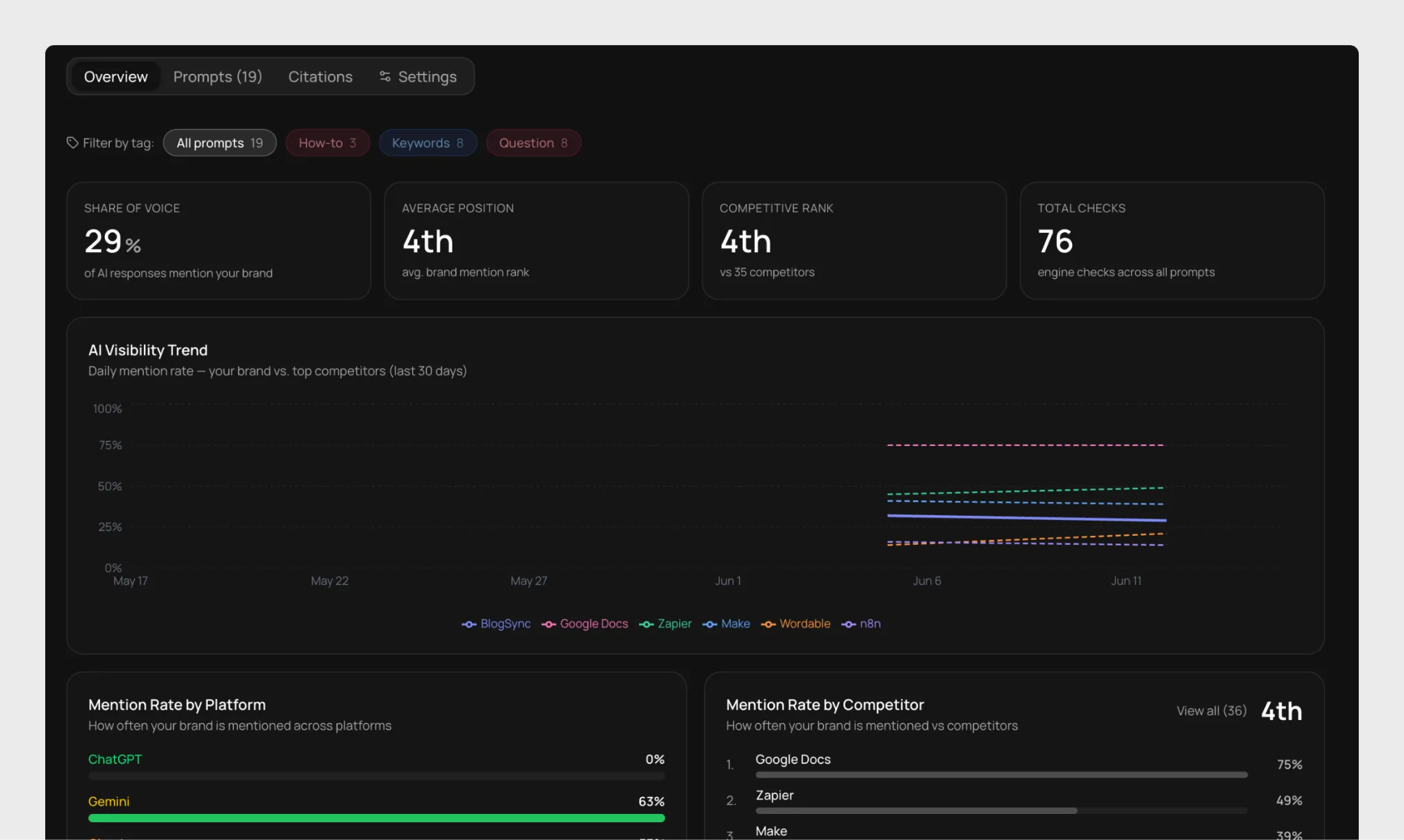
This report shows AI search visibility: what prompts we’re showing up for, what position, what our Share of Voice is compared to competitors, etc.
This is a custom dashboard I built, but you can easily use a solution like Profound or Peec to get this data. This helps inform whether the content we create is getting cited or helping to improve our visibility in AI search.
Turning Report Insights Into Content Strategy Decisions
Reporting is not the finish line. It's the starting point for better decisions. Here are a few ways you can use reporting to improve your content strategy.
Double down on what's working
If a particular topic cluster or format is consistently generating leads, that's your signal to do more of it. Look for the patterns: the angle, the format, the CTA, the search intent. Then replicate deliberately.
Build a content refresh queue from your report data
Most websites contain posts that once performed well and have since started slipping.
A well-executed refresh, updating data, deepening topical coverage, tightening for current search intent, often produces faster results than publishing something brand new.
Reallocate based on lead quality, not just volume
A channel that drives 500 visitors with a 0.2% conversion rate is less valuable than one that drives 100 visitors with a 4% conversion rate. Reporting helps you see this clearly.
Know how to present results during slow periods
Traffic dips happen for reasons often outside your control: seasonality, algorithm updates, the growing impact of AI Overviews on organic CTR, AI search platform fragmentation, the list goes on.
When that happens, shift to impact metrics rather than traffic.
If leads are holding steady, or conversion rate is improving, or content-attributed pipeline is growing, those are the stories to tell. Report the full picture, not just the topline number.
And if results are down, be honest about the cause and clear about the response. Stakeholders can handle a rough quarter far more easily than a report that obscures what's happening.
Adjust publishing frequency based on what the data shows
If a higher cadence correlates with traffic and lead growth, that's a case for investing in more capacity. If frequency is high but results are flat, the problem is likely quality or distribution, and reporting helps you see that distinction clearly.
Final Thoughts
The most important thing to internalize about content marketing reporting is that it is not a monthly obligation. It's the feedback loop that makes your content program smarter over time.
Teams that report well make better decisions. Those that don't keep guessing and over-invest in what feels productive.
Start with a clear objective, connect your data, build a simple recurring workflow, and let the insights guide what comes next.